Brand Identity: Bringing a New Tech Conference to Life
Role
Senior Graphic Designer
Industry
IT

Overview
A new conference was being launched for MSPs and IT leaders, centred on real insights, practical advice and honest conversations about the industry.
I was engaged to develop brand concepts that would bring this positioning to life and establish a distinctive identity from day one.
The Challenge
The conference needed an identity that could cut through a crowded market of generic, overly polished tech events.
It had to feel credible, direct and grounded in real-world experience, while also being flexible enough to work across a wide range of touchpoints including digital, social and event environments.
With the name “Catalyst” signalling ideas of ignition, momentum and change, the brand also needed to visually express energy and forward movement without feeling abstract or over-designed.
The Approach
I was tasked with developing a minimum of three distinct brand concepts, each explored across multiple touchpoints to demonstrate how the identity would work in practice.
Working at pace, I developed a series of concepts within a matter of days, each built around a different interpretation of the Catalyst idea, including themes of spark, acceleration and transformation.
Each concept was applied across key assets, such as:
Event branding and signage
Social media and promotional graphics
Presentation and speaker templates
Digital touchpoints.
This ensured stakeholders could clearly visualise how each direction would translate beyond a logo and into a cohesive event experience.


The Outcome
Within a week, a preferred creative direction was selected, reflecting strong alignment with the event’s positioning and audience.
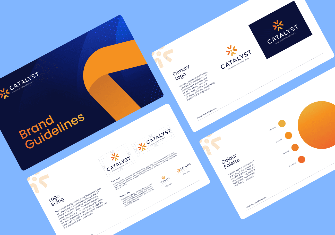
From there, I developed a concise style guide and a suite of core brand assets to support the launch, promotional campaign and website rollout.
The conference was held on 3 June 2026 and was a sellout. The identity provided a strong and flexible foundation across every touchpoint, helping establish a cohesive and memorable event experience.
The result is a clear and distinctive brand that captures the energy of the Catalyst concept while positioning the event as a credible, no-nonsense forum for real industry conversations.

Other projects

Rebrand: Defining a New Direction for an IT Company

Brand Identity: Reimagining an Automotive Tech Event

Rebrand: A Strategic Move from IT Services to Software

Rebrand: A New Identity for Australia’s Leading Bike Transport Company
Website Redesign: Bringing Kiandra’s New Brand to Life

Website Redesign: Driving Online Bookings Through UX Transformation
