Rebrand: A New Identity for Australia’s Leading Bike Transport Company
Role
Senior Graphic Designer
Industry
Transport

Overview
In early 2024, Bikes Only initiated a rebrand, starting with a logo redesign to better reflect its position as Australia’s leading motorcycle transport provider.
Working as a freelance designer for Lekker Agency, I was engaged to develop brand concepts for both the core business and a secondary brand, Bikes Only Transport.
The Challenge
The key challenge was to create a cohesive visual identity across multiple brands, ensuring they felt part of the same family while still being distinct.
The brand also needed to better reflect the nature of the business. As a transportation company, it required a stronger sense of movement, direction and purpose, while remaining simple and scalable across a wide range of applications.
The Approach
I developed a series of brand concepts centred around the idea of movement, aligning the visual identity with the core function of the business.
The solution focused on:
Creating a distinctive logo mark by integrating a forward-moving arrow into the letter “B”, symbolising motion and progress
Designing a flexible identity system that could be applied consistently across both Bikes Only and Bikes Only Transport
Ensuring the concept translated effectively across multiple touchpoints, including digital, print and large-scale applications such as truck graphics.
The approach balanced simplicity with meaning, creating a mark that was both recognisable and conceptually aligned to the brand.


The Outcome
The concept was selected as one of the leading contenders during the process, demonstrating strong alignment with the brand direction and project objectives.
While the final design direction ultimately differed, the project delivered a well-resolved and strategically grounded identity concept, and contributed to the broader rebranding exploration.
It was a valuable opportunity to shape the visual direction of a nationally recognised transport brand and collaborate within an agency-led rebrand process.


Other projects

Rebrand: Defining a New Direction for an IT Company

Brand Identity: Reimagining an Automotive Tech Event

Brand Identity: Bringing a New Tech Conference to Life

Rebrand: A Strategic Move from IT Services to Software
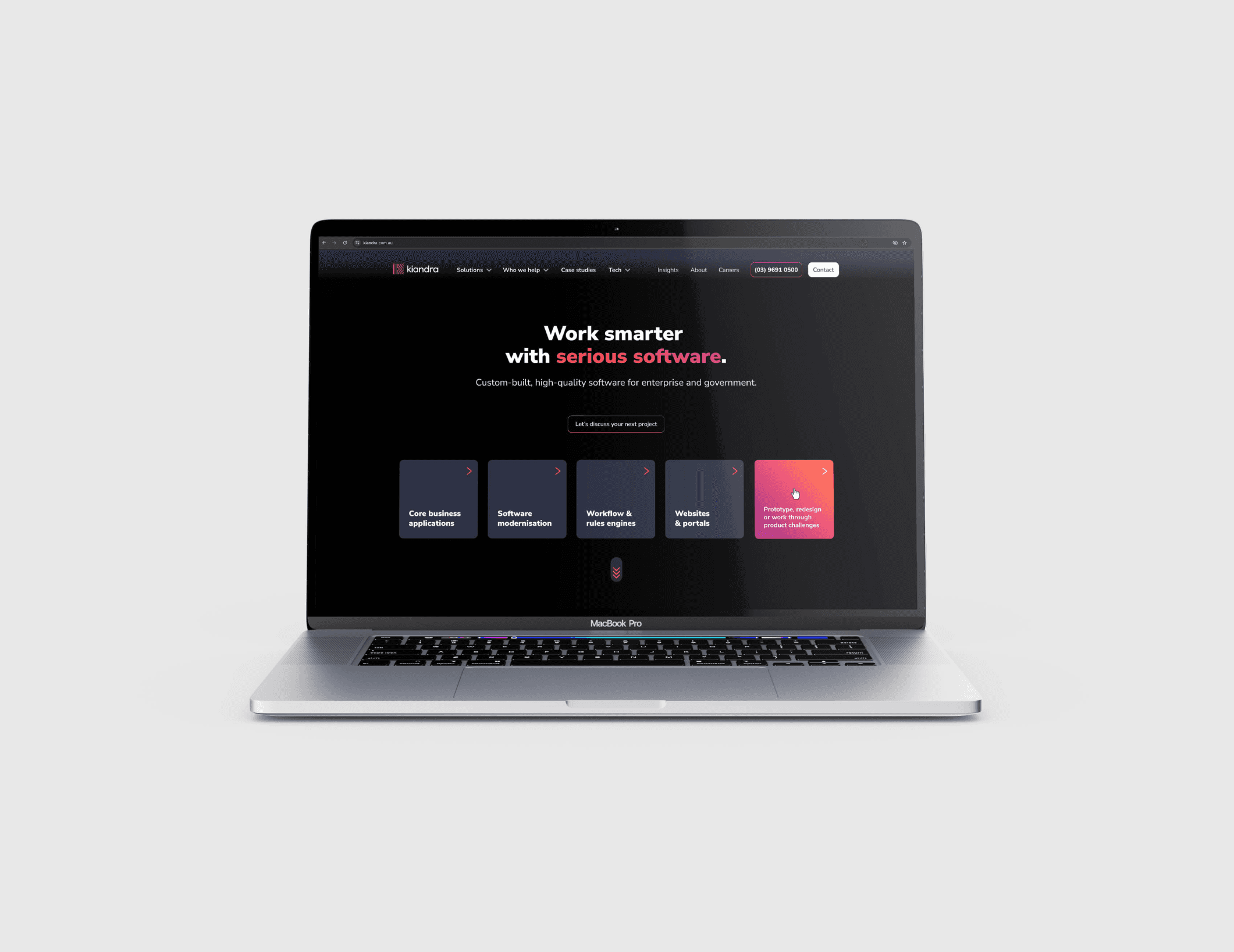
Website Redesign: Bringing Kiandra’s New Brand to Life

Website Redesign: Driving Online Bookings Through UX Transformation
