In early 2020, Kiandra divested its technology services division and underwent a rebrand – with one main aim: transforming from an outdated IT company into a progressive software development company. Key to this was the development of a new logo and visual identity.


Kiandra collaborated with a branding agency to craft a distinctive brand mark. Inspired by the essence of identity and unity, the resulting emblem combines the contours of a 'K' with the intricate patterns reminiscent of a fingerprint, creating both a sense of individuality and belonging.
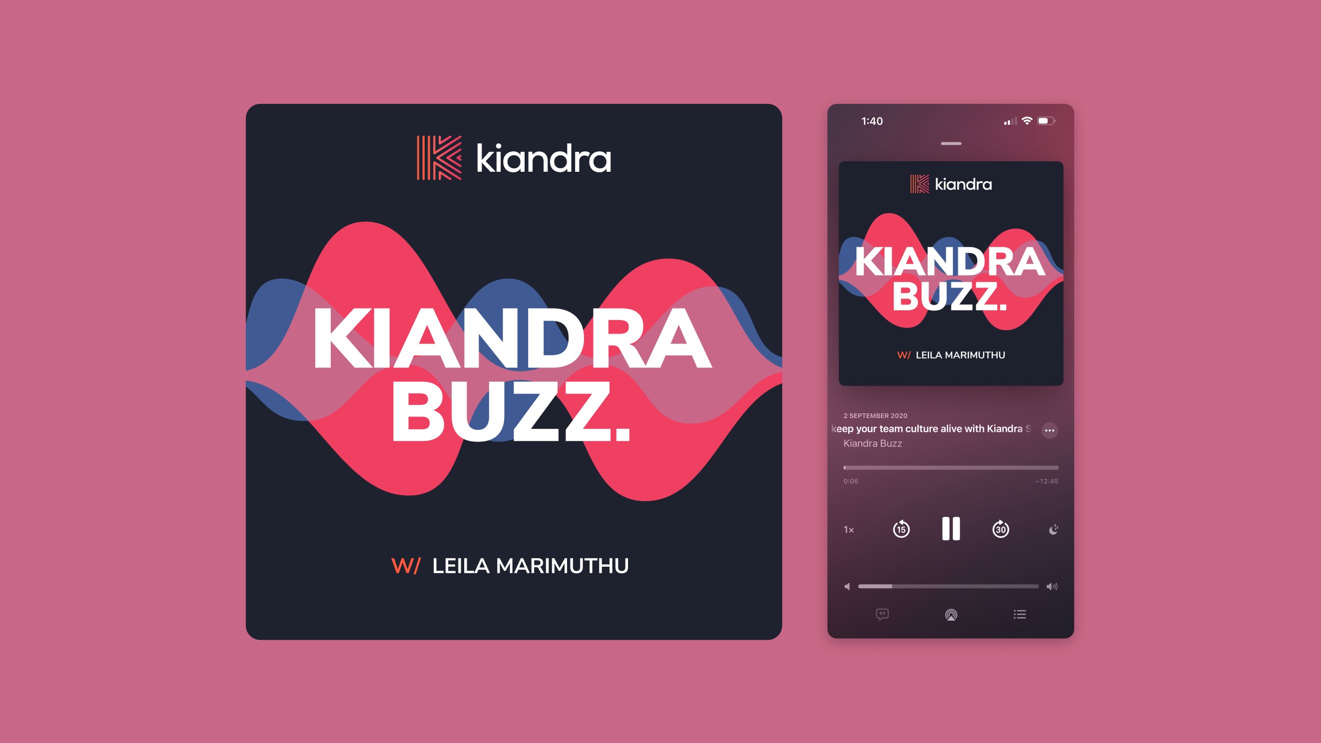
I took this brand mark and applied a new colour scheme – a watermelon and orange gradient to emphasise the boldness and vibrance of our brand. From there, a font was chosen and our logo was complete.
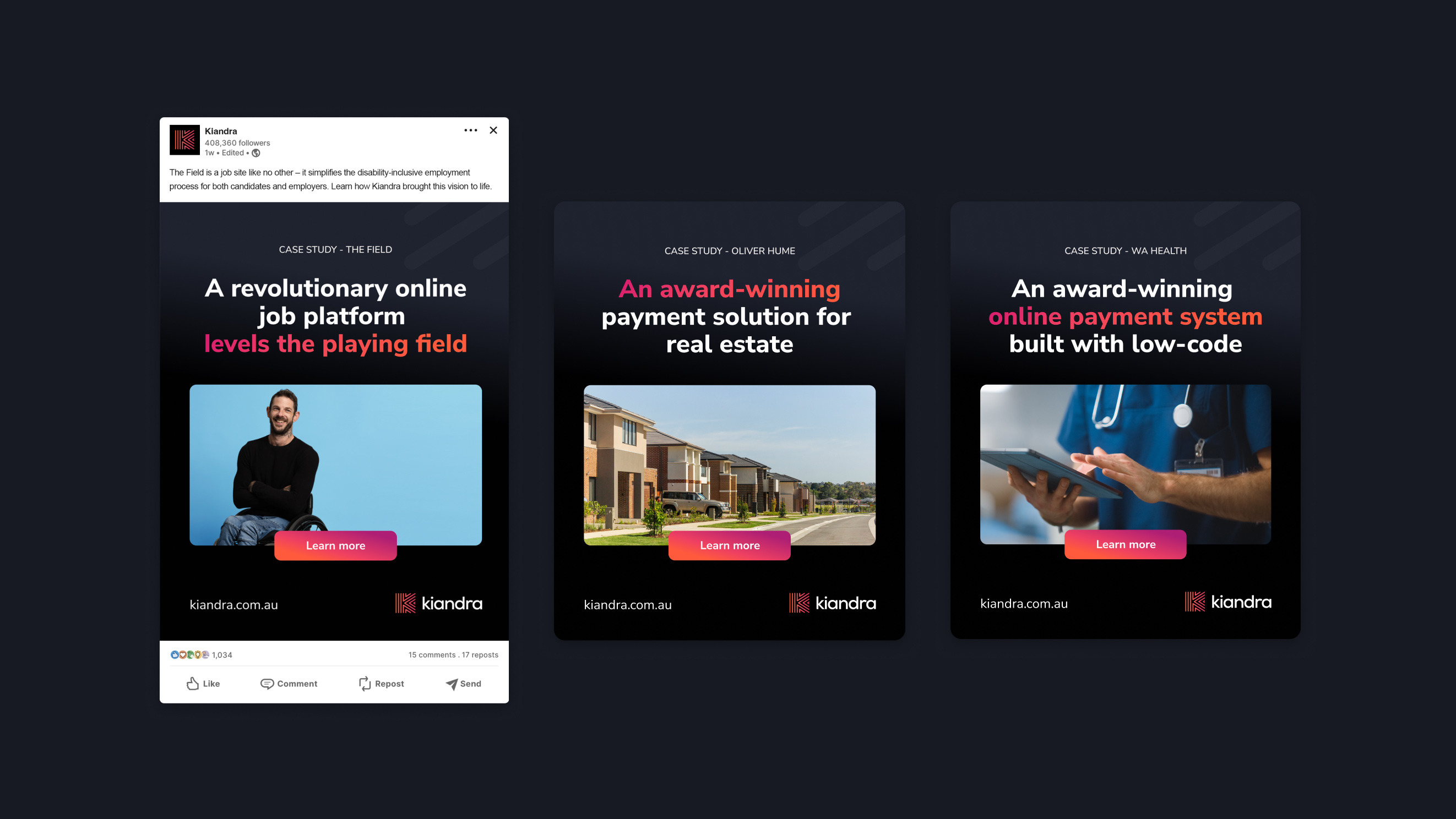
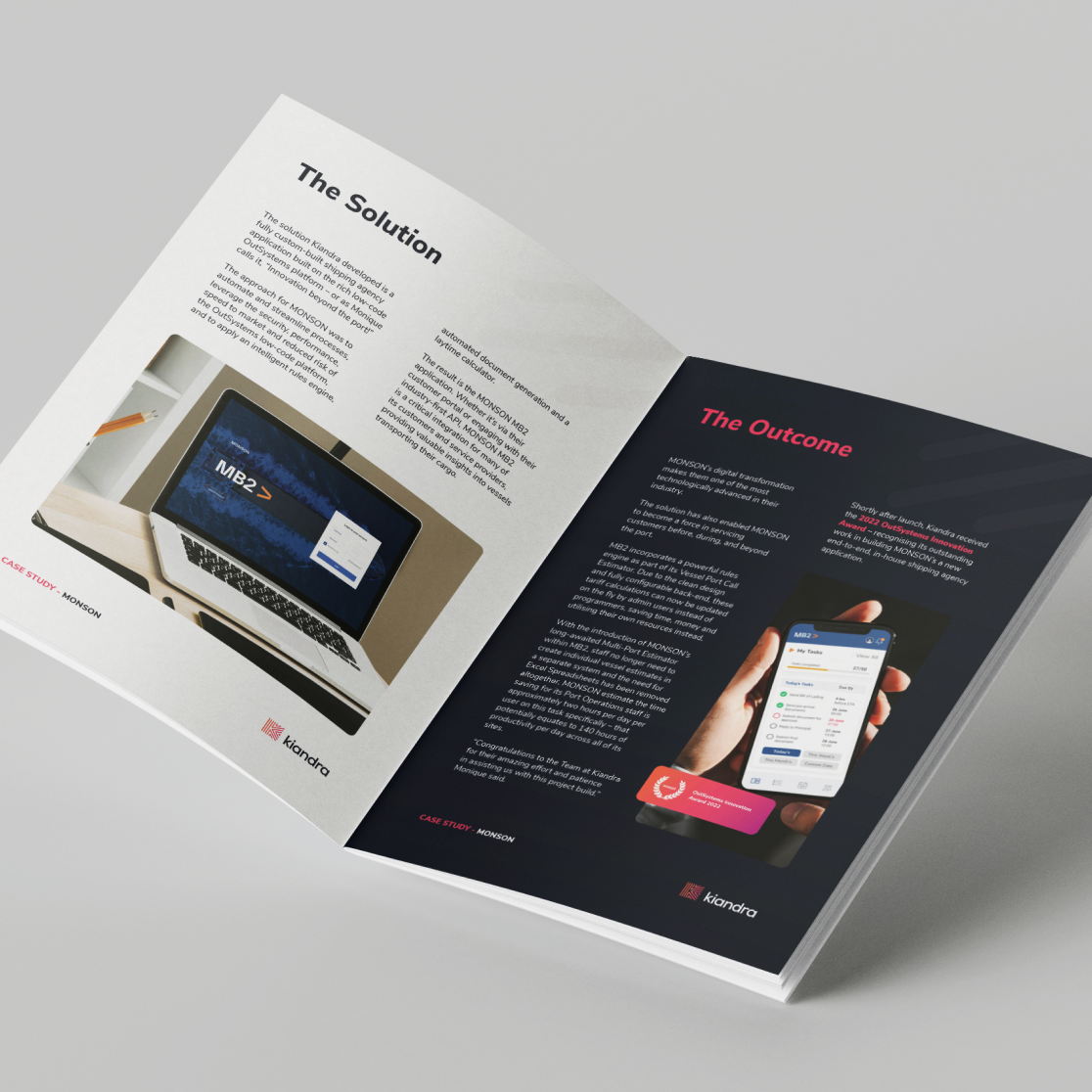
With a new logo and colours in tow, I was then able to develop new brand guidelines and begin creating key collateral for the business.
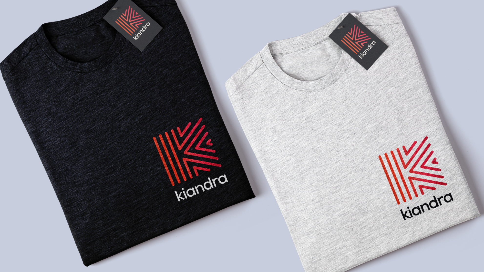
Martin Cooperwaite, Kiandra's Co-founder and Director was delighted with the brand's visual identity and roll-out of new collateral, stating "Tom was central and instrumental in every aspect of our branding – from ideation and inspiration, through to the core creative design and asset development to produce every related artefact we needed. His broad knowledge with digital and print, and across many different formats and application templates ensured we also had an extensive and robust brand definition and platform to produce everything from T-shirts and welcome packs, to proposals and presentations."
"An extensive and robust brand definition and platform to produce everything from T-shirts and welcome packs, to proposals and presentations."
.png)
Almost four years on and Kiandra's brand identity remains unique, boldly standing out from its competitors in a very cluttered market. Cameron Brookes, Co-founder of Kiandra said "The brand looks better than it ever has".